Three-part illustration comparing classic candlestick charts, a time-based price trend, and a volume profile chart, showing market microstructure concepts.

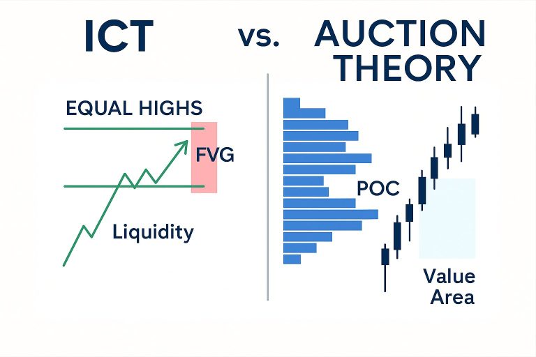
Market Microstructure & Volume Analysis – Part 1

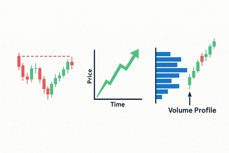
What’s Missing in Classic Candlestick Charts? 🔍 Why Candlesticks Aren’t Telling You the Whole Story Traditional candlestick charts are useful — they show you open, high, low, and close over a period of time. But here’s the problem: They don’t show how price moved. Was the move driven by heavy buying or just a lack…

Side-by-side comparison of ICT trading concepts and Auction Theory. The ICT side shows equal highs, liquidity, and a Fair Value Gap. The Auction Theory side shows a volume profile, Point of Control (POC), and value area with candlestick chart.
|

ICT Concepts VS Tools Like Footprint Charts, POC, Volume Profile, Auction Theory, and Sierra Chart

You said: If you compare ICT (Inner Circle Trader) concepts with tools like Footprint Charts, POC, Volume Profile, Auction Theory, and Sierra Chart, what is your thoughts? ChatGPT said: Comparing ICT (Inner Circle Trader) concepts with tools like Footprint Charts, POC, Volume Profile, Auction Theory, and Sierra Chart is extremely fruitful. They come from different…